When buying your first house/apartment you often hear this bit of advice: Don’t get emotionally attached to any single house, even after you’ve put in an offer. Too many variables, too many things that can change suddenly. It turns out a similar warning holds for a book: Don’t get attached to the ARC cover.
I had gotten quite fond of the big, perky, yellow duck that squats on the cover of the Advance Reader’s Copy of Regarding Ducks and Universes. However, the book’s publisher, the good folks over at AmazonEncore, after some consideration, suggested that that cover felt “unfinished” and “didn’t reflect the depth of the book.” So they sent me a pdf file of a new one. What did I think?
It took me about a day to come to this conclusion: By golly, they’re right. The new cover is better. More intriguing, more indicative of the book as a parallel-universe mystery. “Fun, mysterious, dramatic,” my friend Mary Alterman said. “It pulls you in,” Jo, another friend from my writing group, commented.
In a previous post, I’d merrily informed the giveaway winners that there’d only be minor changes between the ARC, the warts-on version of the book, and the final product. A handful of typos to be fixed, I wrote, a small goof with a date, a runaway case of italics, some small edits in the text, that was all. No major changes, I said. Wrong I was.
So in with the new:
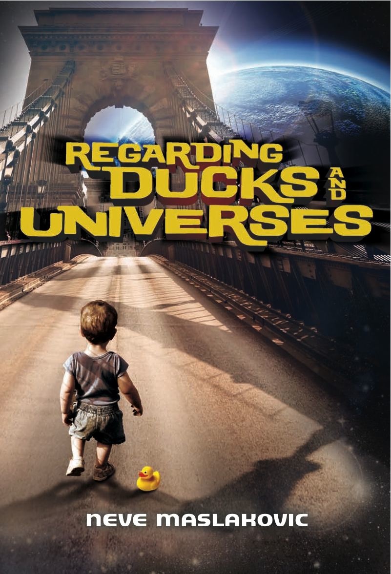

I’ll probably always feel a bit of nostalgia for the old cover. But, on the plus side, procrastinating on ordering cover-based bookmarks (in lieu of business cards) turned out to be not such a bad idea after all.
